Gallery Z doesn’t come with a skin of its own. The filter buttons start from your theme’s button style, captions use your theme’s fonts, and the rest is a handful of CSS classes and custom properties. That makes it easy to give a gallery your own look – in theme.json, with a block style, or with a few lines of CSS. Here are four tested examples.
Everything below goes into your theme: theme.json for the first example, functions.php for the others. If you use a theme you didn’t write, put the PHP into a child theme or a small plugin, so an update doesn’t remove it.
What you’re styling
Two blocks do the work. The Gallery Filter (gallery-z/filter) renders a row of button.gallery-z-filter__button elements – the current one has the class is-active and aria-pressed="true" – or a select.gallery-z-filter__select when it’s shown as a dropdown. The Filterable Gallery (gallery-z/gallery) holds a .gallery-z-items container; every photo or post inside it is a .gallery-z-item, and captions are ordinary figcaption elements.
The filter has six built-in styles: Theme button (the default), Theme link, Soft, Pills, Segmented and Underline. Every button carries WordPress’s wp-element-button class, so the default style is simply your theme’s button. The other styles only change how the inactive buttons differ from the active one.
One rule to keep in mind: what you set in the block sidebar wins. Typography, border and shadow settings of the filter are written onto each button as inline styles, and the gallery writes its caption size and alignment inline too. So use CSS for what the sidebar doesn’t offer, and the sidebar for the rest.
1. Theme buttons from theme.json
The quickest way to restyle every filter on a site is not to touch the filter at all. Change the theme’s button element, and the filter follows – together with every other button. To give only the filter something extra, add a block-level style for gallery-z/filter. Its buttons are button elements, so elements.button inside the block reaches them:
{
	"version": 3,
	"styles": {
		"elements": {
			"button": {
				"color": { "background": "#1f3a5f", "text": "#ffffff" },
				"border": { "radius": "6px" },
				"typography": { "fontWeight": "600" }
			},
			"link": {
				"color": { "text": "#1f3a5f" },
				":hover": { "color": { "text": "#c2410c" } }
			}
		},
		"blocks": {
			"gallery-z/filter": {
				"color": { "text": "#1f3a5f" },
				"elements": {
					"button": {
						"border": { "radius": "999px" },
						"typography": {
							"fontSize": "0.8125rem",
							"letterSpacing": "0.06em",
							"textTransform": "uppercase"
						}
					}
				}
			}
		}
	}
}
Merge these keys into the styles section of your existing theme.json. The active button now gets the navy fill of the theme button; the inactive ones are outlined in the filter’s text color, because that is what the default style does with them. The block-level rule makes this filter’s buttons pill-shaped, small and uppercase without changing the site’s other buttons.
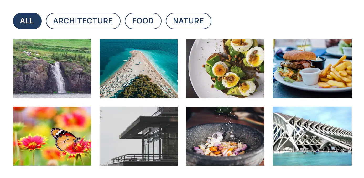
The link element matters for the Theme link style: it makes the buttons look like the theme’s links, and reads the link color, hover color and underline from the global styles. Switch the filter to Theme link, and it picks up the navy and orange above.
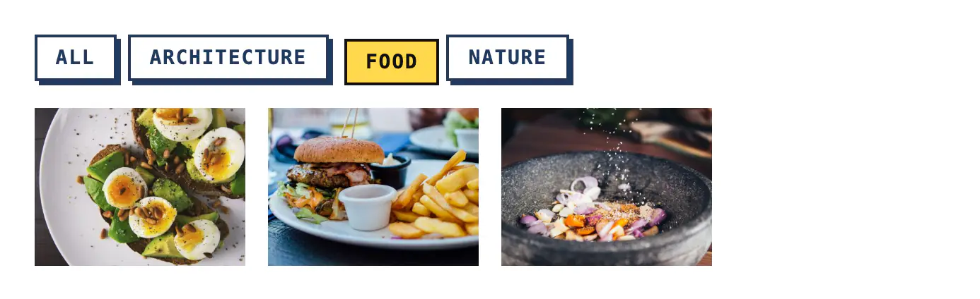
2. A filter style of your own
When the six styles aren’t enough, register another one. A block style adds the class is-style-{name} to the block and appears in the Styles panel next to the built-in ones, so editors can pick it like any other:
add_action(
	'init',
	static function () {
		register_block_style(
			'gallery-z/filter',
			array(
				'name'         => 'stamp',
				'label'        => __( 'Stamp', 'my-theme' ),
				'inline_style' => '
.wp-block-gallery-z-filter.is-style-stamp .gallery-z-filter__button {
	border: 2px solid currentcolor;
	border-radius: 0;
	color: inherit;
	background: transparent;
	box-shadow: 3px 3px 0 currentcolor;
	font-family: ui-monospace, SFMono-Regular, Menlo, monospace;
	text-transform: uppercase;
	transition: transform 0.15s, box-shadow 0.15s, background-color 0.15s;
}
.wp-block-gallery-z-filter.is-style-stamp .gallery-z-filter__button:hover {
	transform: translate(-1px, -1px);
	box-shadow: 4px 4px 0 currentcolor;
}
.wp-block-gallery-z-filter.is-style-stamp .gallery-z-filter__button.is-active {
	color: #111;
	background: #ffd84d;
	box-shadow: none;
	transform: translate(3px, 3px);
}',
			)
		);
	}
);
On a block theme, WordPress prints this CSS only on pages that use the filter, like the plugin’s own styles. Two details are worth copying. First, the plugin’s rules for inactive buttons only apply to its own styles, so a new style starts from the theme button and sets everything it needs itself. Second, the active button is found by .is-active, which the plugin keeps in step with aria-pressed – style that state and keyboard and screen reader users get the same feedback as everyone else. The plugin’s focus ring (a 2px outline in the text color) stays in place, because the example doesn’t touch outline.
3. A caption look through CSS variables
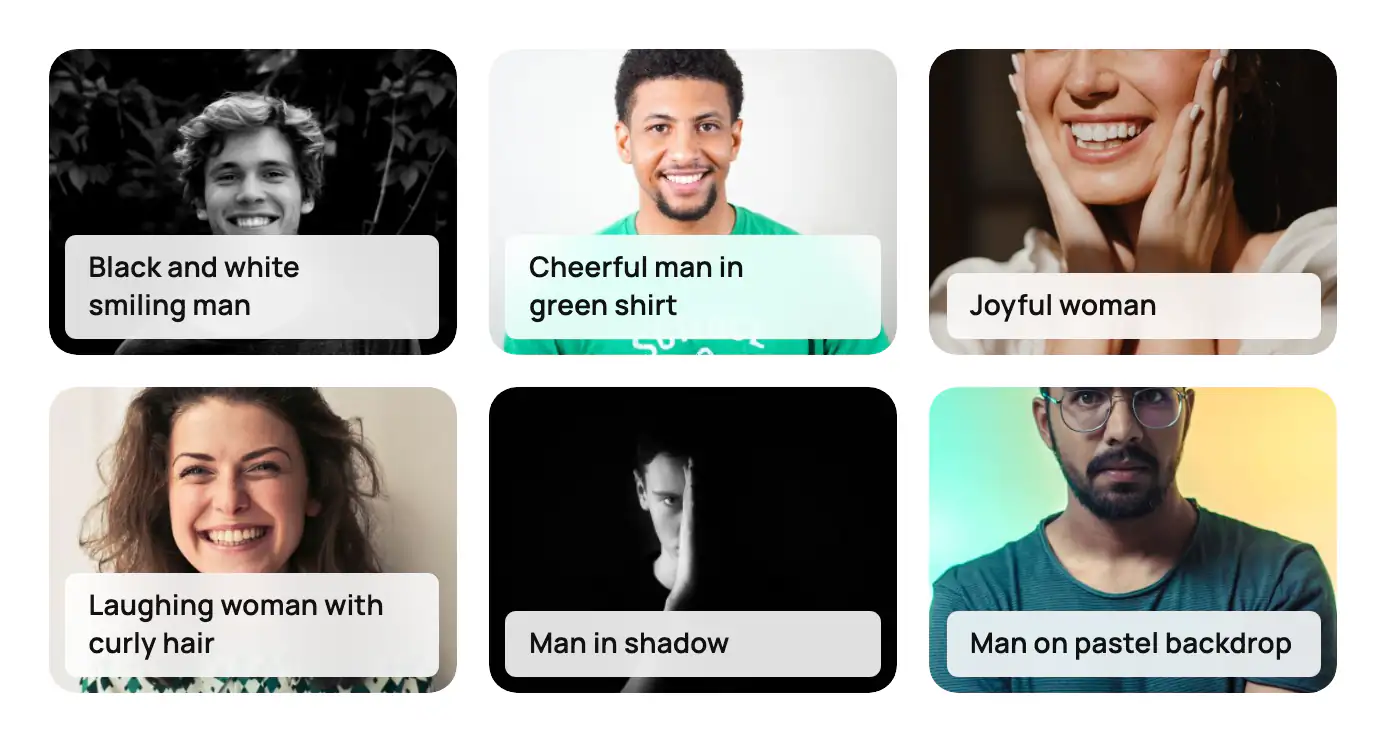
Captions have their own presets in the block (Card, Gradient overlay, Frosted glass and more), and a text and background color. When you want the same look on every gallery without setting colors each time, use the custom properties the captions are built on:
| Property | What it sets |
|---|---|
--gallery-z-cap-color | Caption text color |
--gallery-z-cap-bg | Caption background (a color or a gradient) |
--gallery-z-radius | Corner radius of each photo |
--gallery-z-radius-br, --gallery-z-radius-bl | Bottom corners, which captions on the photo follow |
The block only writes the color variables when you pick a color in the sidebar, and the radius variables when you set a radius, so a class can provide defaults for all of them. Size and alignment are always written by the block – use its settings for those.
add_action(
	'init',
	static function () {
		register_block_style(
			'gallery-z/gallery',
			array(
				'name'         => 'label',
				'label'        => __( 'Label captions', 'my-theme' ),
				'inline_style' => '
.wp-block-gallery-z-gallery.is-style-label {
	--gallery-z-cap-bg: rgb(255 255 255 / 88%);
	--gallery-z-cap-color: #111;
	--gallery-z-radius: 14px;
	--gallery-z-radius-br: 14px;
	--gallery-z-radius-bl: 14px;
}
.wp-block-gallery-z-gallery.is-style-label figcaption {
	font-weight: 600;
	letter-spacing: 0.01em;
}',
			)
		);
	}
);
Pick the style, set the captions to on the image and the look to frosted glass. The glass caption sits inset from the photo’s edges, and its corners follow the photo’s radius minus that inset, so the rounding stays even.
4. A hover effect of your own
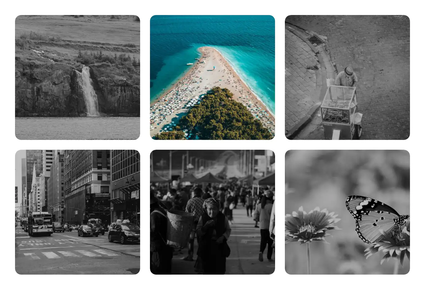
The built-in hover effects are zoom (the default), lift, color on hover and dim others. For something else, set the gallery’s Hover effect to None so the two don’t mix, and add your own. This one turns every other photo grey while one is hovered:
add_action(
	'init',
	static function () {
		register_block_style(
			'gallery-z/gallery',
			array(
				'name'         => 'spotlight',
				'label'        => __( 'Spotlight', 'my-theme' ),
				'inline_style' => '
.wp-block-gallery-z-gallery.is-style-spotlight .gallery-z-item {
	overflow: hidden;
	border-radius: var(--gallery-z-radius, 0);
}
.wp-block-gallery-z-gallery.is-style-spotlight .gallery-z-item img {
	transition: filter 0.4s ease, transform 0.6s cubic-bezier(0.22, 1, 0.36, 1);
}
.wp-block-gallery-z-gallery.is-style-spotlight .gallery-z-items:has(.gallery-z-item:hover) .gallery-z-item:not(:hover) img {
	filter: grayscale(1) brightness(0.75);
}
.wp-block-gallery-z-gallery.is-style-spotlight .gallery-z-item:is(:hover, :focus-within) img {
	transform: scale(1.04);
}
@media (prefers-reduced-motion: reduce) {
	.wp-block-gallery-z-gallery.is-style-spotlight .gallery-z-item img {
		transition: none;
	}
	.wp-block-gallery-z-gallery.is-style-spotlight .gallery-z-item:is(:hover, :focus-within) img {
		transform: none;
	}
}',
			)
		);
	}
);
It’s plain CSS: no script, no layout work, nothing that runs while the mouse is elsewhere. :has() is supported in every current browser; where it isn’t, the grey-out simply doesn’t happen and the zoom still works. The :focus-within part gives keyboard users the same zoom when they tab to a photo, and the reduced-motion block keeps it still for people who asked for less movement.
A few more hooks
- Filter spacing: the gap between buttons is the
--gallery-z-filter-gapproperty (0.5rem by default); the block’s own gap setting writes it too. - Counts: the numbers next to the labels are
.gallery-z-filter__count, colored by--gallery-z-count-color; the badge style also reads--gallery-z-count-bg. - Dropdown: the select is
.gallery-z-filter__selectand inherits the filter’s font and color. - Hidden items: filtered-out items get
gallery-z-is-hidden. Don’t style them visible – the filter relies on it.
Test your style with a keyboard once: tab through the filter, press Enter on a button, tab into the gallery. If the focus ring and the active state are both easy to see, the style is done.
All four examples were tested with Gallery Z on WordPress 7.1 and Twenty Twenty-Five; the screenshots are from that test site. More class names and filters are in the developer notes.